Mission
To visualize the data, the estimates and the projections that are relevant to our daily lives in Miami Beach, as we try to make sense of the COVID-19 pandemic.
Values
Scope of practice
I'm an expert in software and data engineering and data analysis. I'm not a medical doctor, virologist, or an epidemiologist. I'm limiting the scope of this project to data issues to avoid the Dunning–Kruger effect.Continuous, iterative improvement
Forecast models and scientific knowledge are always advancing, and I'm always trying to represent the most-current ideas. I'm constantly adjusting my methods.Transparency
My analysis spreadsheet and data are available on GitHub, along with the complete version history. As well as the code for this web site.Documentation
I intend to provide explanations for all of my estimations and projections, and citations. All of my references are documented.Visualization best practices
Every chart should include a title, units, clear axis labeling, and a time stamp.Mobile compatibility
All images should be legible on any device, including tiny phone screens.Feedback
Please contact me and let me know if you think that any of my methods could be improved, or if any chart is in error and should be deprecated.
Background
I’m a Miami Beach resident, sitting in my condo during the lockdown and trying to make sense of all of it. I also happen to be a data scientist. I’m a technology executive at a hospitality company with my own pressing questions about what’s going to happen. One of my professional responsibilities is data analysis and data engineering. I make visualizations whenever I ask questions about data, and I’m publishing the visualizations that I’ve made about local COVID-19 data here so that my friends and neighbors can see how the data affects them too.
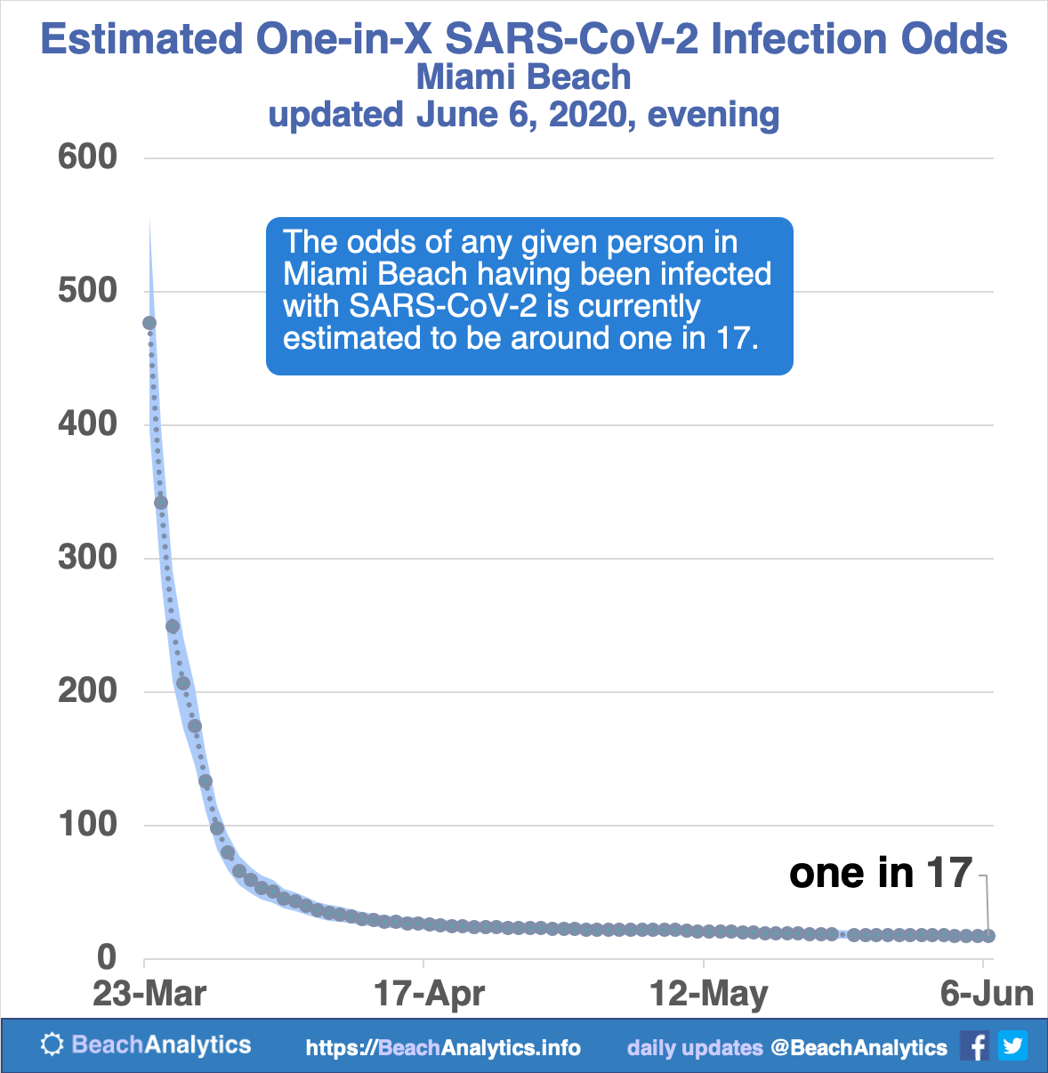
What are the odds?
This all started bwecause I wanted to know if it was safe to go to the grocery store, but I couldn’t find an estimate of the odds of any given person around me having been infected. So I had to find my own way to estimate those odds. I was surprised to conclude that a room full of fifty random people in Miami Beach almost certainly contained at least one person who had been infected. And so I stopped going to the grocery store.
What does it look like over time?
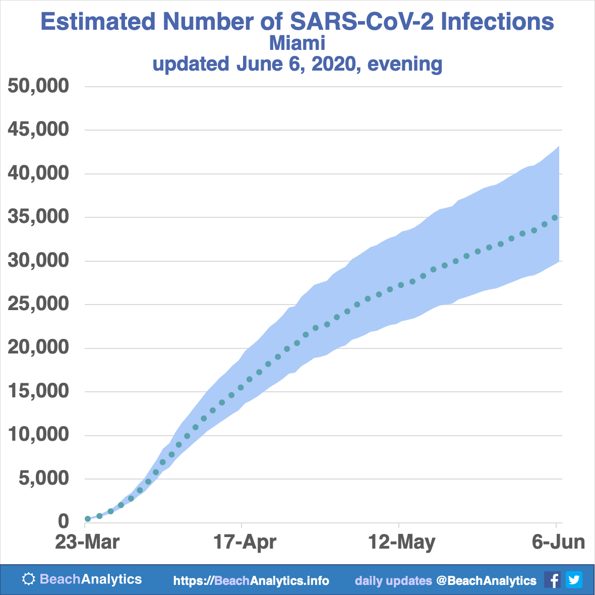
Once I had that estimate, I wanted to visualize the rate of change. So I started an Excel spreadsheet for analysis, with charts. I used the data released twice a data since March 23, 2020 from the Florida Division of Emergency Management.
Here’s the latest version of that first odds chart:
More charts from more angles
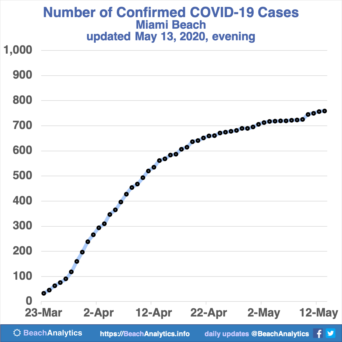
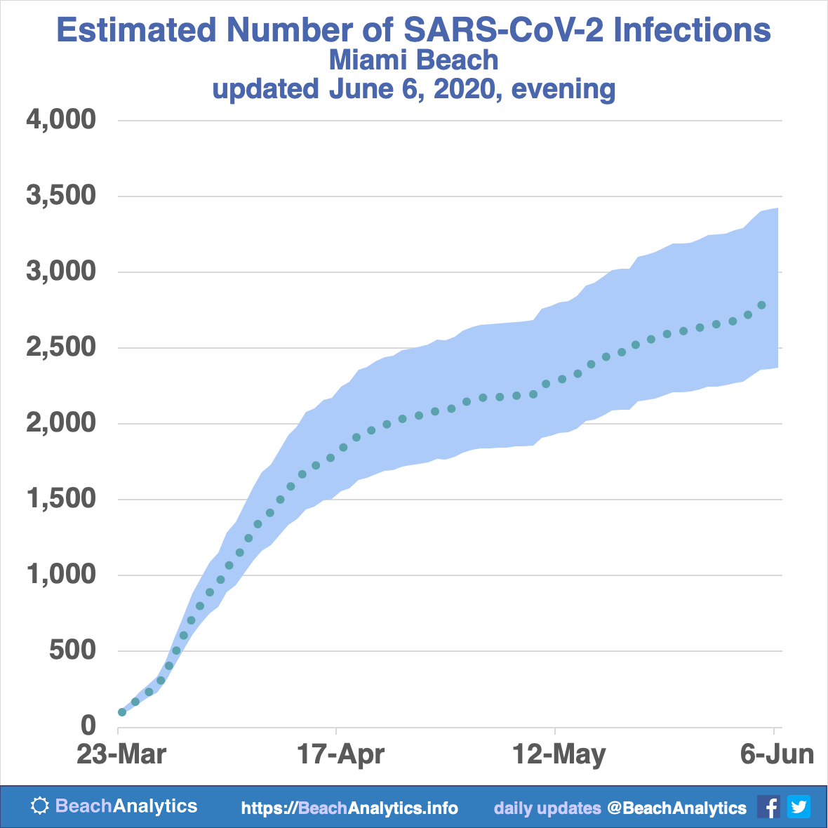
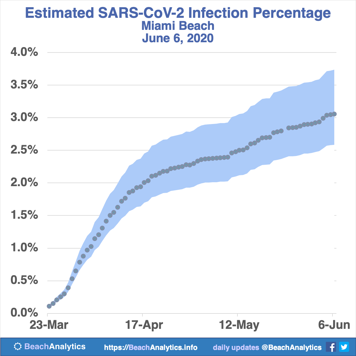
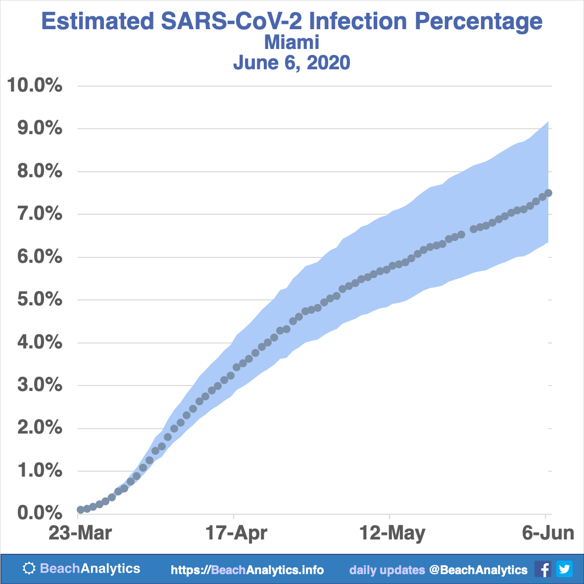
Next, I carefully designed charts showing the number of cases over time, the range in estimates for the number of infections over time, the number of cases as a percentage of the population, the number of infections as a percentage of the population, and the odds of any given person being infected. I designed the charts to be easy to update, but they’re intended to be updated by hand, with annotations for key insights.
What about Miami? And the rest of Florida?
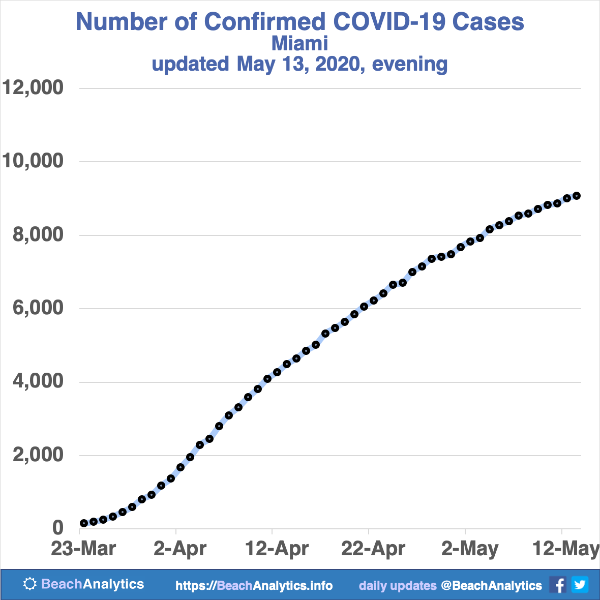
Then I generalized the charts and added tracking for data for Miami and for the state of Florida. Now I’m tracking all of those areas, and I have recorded their estimated populations for each so that I can visualize numbers as a percentage of the population.
Sources
The infection estimates here are based on the confirmed case counts for the city of Miami Beach in the daily updates from the Florida Division of Emergency Management at https://www.floridadisaster.org/news-media/news/
The FDOH has been publishing these city-by-city counts since March 23, so that’s the start date on the data in this analysis.
Mechanism
I built an automated scraper and data mart for extracting numbers from the PDF reports from a spreadsheet at the Florida Divison of Emergency Management that isn’t public. The data goes into Google Sheets, where I can analyze it with Google Data Studio. I’m still setting that up now, and I’m currently using an Excel spreadsheet to manually generate each image. It will be more efficient and fully automated soon. I’m only one person and I have to balance time with building the web site, researching and writing content, and my actual day job that I thankfully still have for now.


