May 22, 2020
COVID-19 forecasting models
Interpretations from COVID-19 forecasting models make headlines nearly every day lately. To interpret the results of a predictive analytics model you have to understand the assumptions behind the model and its methods. I’m compiling a catalog of the more prominent models, along with ensemble visualizations that combine the forecasts of all of the models.
Related
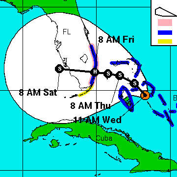
Don’t treat the center line of the IHME forecast charts as a precise prediction, any more than you would assume that a hurricane will follow the center line on the NHC hurricane forecast cone images. The forecast is a wide range, not a specific number.
The widely-cited IHME model does not forecast that the COVID-19 epidemic will peak
No report from any forecast model has ever had such a significant impact on worldwide human society.


