May 24, 2020
IHME COVID-19 forecasting model
Criticized at times both for being too optimistic[1] and too pessimistic[2], the COVID-19 forecasting model from the University of Washington’s Institute for Health Metrics and Evaluation has been one of the most widely discussed forecast models of the pandemic. President Trump recently used the IHME model as the basis of his prediction that there would only be about 60,000 deaths in the US.[1] The model’s accessible dashboard renders projections in charts that are easy to understand.[3]
But the IHME model has also been widely misinterpreted, and has been used as the basis of a lot of misinformation. For example, the IHME researchers are continually adjusting the parameters of the model to improve its accuracy. Some people have interpreted the model’s constant evolution as evidence that the forecasts are unreliable.[4] Perhaps at the most extreme is the conspiracy theory that IHME forecasts that have been higher than reality reveal that the threat of COVID-19 has been overblown, in order to justify lockdowns that are cover for imposing a totalitarian surveillance state.[5]
Understanding any model’s assumptions and methods is critical for interpreting what the model’s results are saying, and what they’re not saying.
What does it say?
The goal of the IHME model is to provide a planning tool for health departments and other government officials.[6] The tool attempts to forecast the point when social distancing measures can be relaxed, by providing estimates of when infections could drop to 1 per 1 million people.
At that point, it may be possible to relax social distancing, if – and only if – widespread testing, contact tracing, isolation, and limitations on mass gathering are in place. The timeline could change based on what new data shows about the trajectory of the pandemic.
What does it NOT say?
The biggest and most dangerous misinterpretation of the IHME model’s forecasts is the widespread belief that the model is projecting that death rates will peak and then subside and then the virus will go away. That isn’t what the model is forecasting at all. The researchers are explicit that they are only analyzing the “first wave” of the pandemic.[7]
It is critical to note that we restrict our projections to the first wave of the pandemic under a scenario of continued implementation of social distancing mandates and do not yet incorporate the possibility of a resurgence or subsequent waves.
Strengths
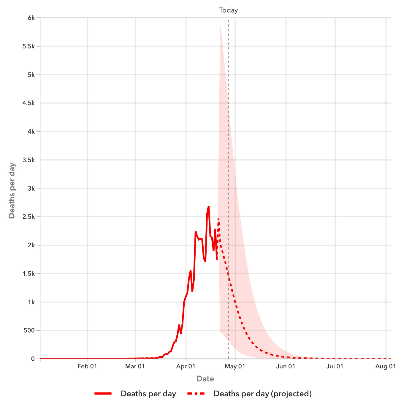
The IHME results are so widely influential because they’re so easily accessible. The model’s forecast dashboard has a URL that anyone can view at any time. The dashboard’s charts are easy to understand: “Deaths per day”, “Hospital resource use”, “Total deaths.”
Weaknesses
That accessibility might also be one of the model’s biggest weaknesses.
Easily misinterpreted
The National Hurricane Center releases hurricane forecast images that show the current position of the hurricane, along with a projected path and a cone of uncertainty. Some critics have claimed that the center line confuses the public because it unduly focuses people too much the false idea of a precise forecast, when in reality the forecast is a wide range.[8]
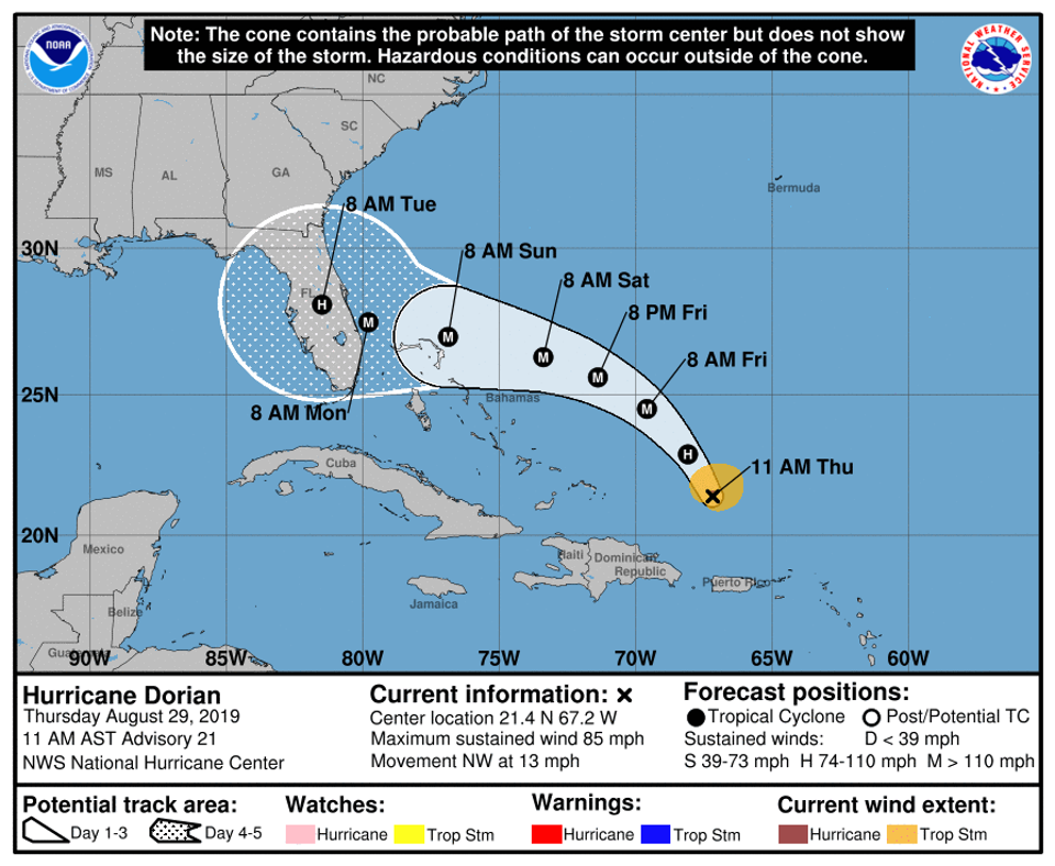
In 2004, the NHC projections for the path of Hurricane Charley showed a cone of uncertainty for where the storm would make landfall that showed the center line of the storm passing directly over Tampa Bay. The forecast then changed, putting the center line over Charlotte County, a hundred miles south of Tampa. That area, full of retirees, was devastated. People hadn’t evacuated because they thought that the NHC was telling them that the storm was going to hit Tampa Bay, a hundred miles north of them. Misinterpretation of a forecast graphic cost lives.
Many people, including even President Trump, have misinterpreted the center line of the IHME projections. Trump’s famously-optimistic projection that only 60,000 people would die in the entire COVID-19 epidemic in the US was an obvious misinterpretation of both the center line of the IHME charts and the overall intent of the model: to project the impact of the first wave of the epidemic.[9]
Purely statistical
The IHME model doesn’t understand anything about the dynamics of how the virus spreads. It doesn't consider how easily it spreads or how long someone can be infected before they show symptoms. And it certainly doesn’t consider the Heisenberg Effect, in terms of the effect that its own projections might have on the public’s behavior. It is purely a statistical model[10]
The model looks at other places that have already been hit by the pandemic, like China and Italy. It assumes that the infection will always taper off the way that it has in those places, and it tries to estimate when that might happen. The model’s assumptions about the population maintaining measures to slow the spread of the virus are the main factors that affect the forecast. The researchers at IHME are constantly adjusting the input parameters based on new data, including changes in public behavior. Ironically, some of these changes in behavior are now influenced by the model itself, creating a sort of Heisenberg-Effect feedback loop.
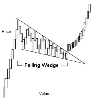
The IHME model’s forecast is based only on the shapes of curves on charts. It’s not a simulation model like the Imperial College model. Some people forecast stock prices by fitting current stock prices to patterns like Fibonacci numbers[11]. For example, the “Falling Wedge” pattern pictured is a downward trend that some stock analysts see as an indication that the price will rise in the future.[12]
The IHME model is similar to this kind of pattern-matching forecast. It doesn't even try to understand the incubation period of the disease or the percentage of asymptomatic people, or anything else about the disease itself. It only looks for patterns in the curves. Other researchers have criticized the model’s methods for departing from classic epidemiological modeling and for optimistically assuming that the shape of the curve will be curtailed by social distancing.[10]
See also
The University of Texas COVID-19 model builds on the IHME model by adding real-time daily social-distancing data.[10]
The UT model also differs from the IHME model by using only US data, instead of assuming that the epidemic in the US will follow the same patterns seen in other countries. And it attempts to improve on the verifiably-wrong IHME model's uncertainty calculations.
Only works with solid death data
The IHME researchers say that the biggest limitation of the model is that the only thing that it knows about the likely trajectory of the epidemic is death rate patterns that we have already observed elsewhere. The model assumes a pattern of deaths that depends on the sort of tapering-off that we have seen in other countries.[7] If we don’t maintain measures to slow the spread of the virus then the model’s assumptions will be invalid, and the model will have little precedent to look toward for understanding what will happen.
The model produces less reliable forecasts in areas where there are low death rates. The researchers have set a minimum of 50 deaths for an area before it can be applied.
It’s also difficult to apply the IHME model in countries with less reliable death data, or with “more complicated data landscapes.”[6]
Misleading journalism
It’s especially dangerous when journalists misunderstand the IHME results and report on them, because they inadvertently spread risky misinformation. In one recent example, CNN reported that “Last week, the model projected 67,641 deaths from Covid-19.”
This is an example of false precision, when numerical data is presented in a manner that implies better precision than is justified.(missing reference) Stating the forecast in terms of a precise center line encourages readers to view the model as a crystal ball. And when the real numbers don’t track the forecast precisely then people will misinterpret or misrepresent the error as evidence that the entire model is invalid and that the experts, in general, are all wrong.[5]
We can’t blame CNN too much in this case, because the false precision comes from the IHME dashboard. The charts on the dashboard clearly show a forecast range, but they also give a handy total. Currently “74,073 COVID-19 deaths projected by August 4, 2020”, as of this writing. The number of significant figures in the dashboard totals are inappropriately overstating the precision of the forecast,[13] and are misleading to the public.
Update includes mask-wearing as a factor
The researchers at IHME have recently added mask-wearing as a factor[14], based on polling data from an app called Premise. They feel that empirical data has recently not tracked their projections because they assumed that increasing mobility data would indicate more infections and deaths, and that the effect was less pronounced than they were expecting. So they hypothesize that behavioral changes may be a contributing factor, and they’re trying to account for it. Other prominent statistical models like the new Bayesian models from PolicyLab and Imperial College that are forecasting exponential new outbreaks in some areas account for changes in mobility but they don’t yet account for that kind of behavioral change. This change led to a revision downward for the number of projected deaths in Florida from May 18, 2020 through August by about 20%, from about six thousand deaths to less than 5000.
Conclusion
The IHME model can be useful for planning how long an area will need to maintain social distancing but it’s easily misinterpreted, and people changing their behavior based on misinterpretation of the projections <could cost lives. It’s critical for journalists who report on the model to understand its assumptions and methods.
The model isn't a crystal ball and it doesn’t understand anything about the virus. It simply projects what the death-rate curve might look like for any given area, based on what the curve has looked like in other areas with similar measures in place to slow the spread of the virus.
The forecasts are no longer valid if people’s behavior changes during the time shown in the projections. The input parameters will then need to be adjusted, and the forecasts will need to be revised. The model is not projecting the overall course of the pandemic and it’s not forecasting that the disease will peak once and then go away.
References
- 1. Cancryn A. How overly optimistic modeling distorted Trump team’s coronavirus response. Politico; 24-April-2020 link
- 2. Clutz R. The Virus Wars. Science Matters; 19-April-2020 link (Accessed 2020-04-27 21:00)
- 3. Ferguson PN, Bhatt DS. COVID-19 Projections. Institute for Health Metrics and Evaluation, University of Washington; 27-April-2020 link (Accessed 2020-04-29 09:00)
- 4. Begley S. Influential Covid-19 model uses flawed methods and shouldn’t guide U.S. policies, critics say. 17-April-2020 link (Accessed 2020-04-27 22:30)
- 5. Knight D. Virologists & Epidemiologists Question COVID Lockdowns. Infowars; 21-April-2020 link (Accessed 2020-04-27 21:30)
- 6. IHME COVID-19 model FAQs. Institute for Health Metrics and Evaluation; link
- 7. Forecasting the impact of the first wave of the COVID-19 pandemic on hospital demand and deaths for the USA and European Economic Area countries. IHME COVID-19 health service utilization forecasting team; 21-April-2020 link (Accessed 2020-04-27 16:00)
- 8. Broad K, Leiserowitz A, Weinkle J, et al. Misinterpretations of the “Cone of Uncertainty” in Florida during the 2004 Hurricane Season. American Meterological Society; May-2007 link (Accessed 2020-04-27 16:00)
- 9. Bump P. Misunderstanding the math, Trump embraced a coronavirus death toll we’ll soon surpass. 24-April-2020 link (Accessed 2020-04-28 9:30)
- 10. Woody S, Tec M, Dahan M, et al. Projections for first-wave COVID-19 deaths across the US using social-distancing measures derived from mobile phones. The University of Texas at Austin COVID-19 Modeling Consortium; 23-April-2020 link; DOI: 10.1101/2020.04.16.20068163 (Accessed 2020-05-12 16:12)
- 11. Mitchell C. Fibonacci Retracement Levels. Investopedia; 19-April-2020 link (Accessed 2020-05-12 17:48)
- 12. Wedge pattern. Wikipedia; 14-June-2019 link (Accessed 2020-04-27 16:00)
- 13. Significant figures. Wikipedia; 24-April-2020 link (Accessed 2020-04-28 10:00)
- 14. COVID-19 estimation updates. IHME COVID-19 health service utilization forecasting team; link (Accessed 2020-05-24 21:00)
Related

Don’t treat the center line of the IHME forecast charts as a precise prediction, any more than you would assume that a hurricane will follow the center line on the NHC hurricane forecast cone images. The forecast is a wide range, not a specific number.

The widely-cited IHME model does not forecast that the COVID-19 epidemic will peak


