            Apr 29, 2020
            updated Tuesday May 12, 2020

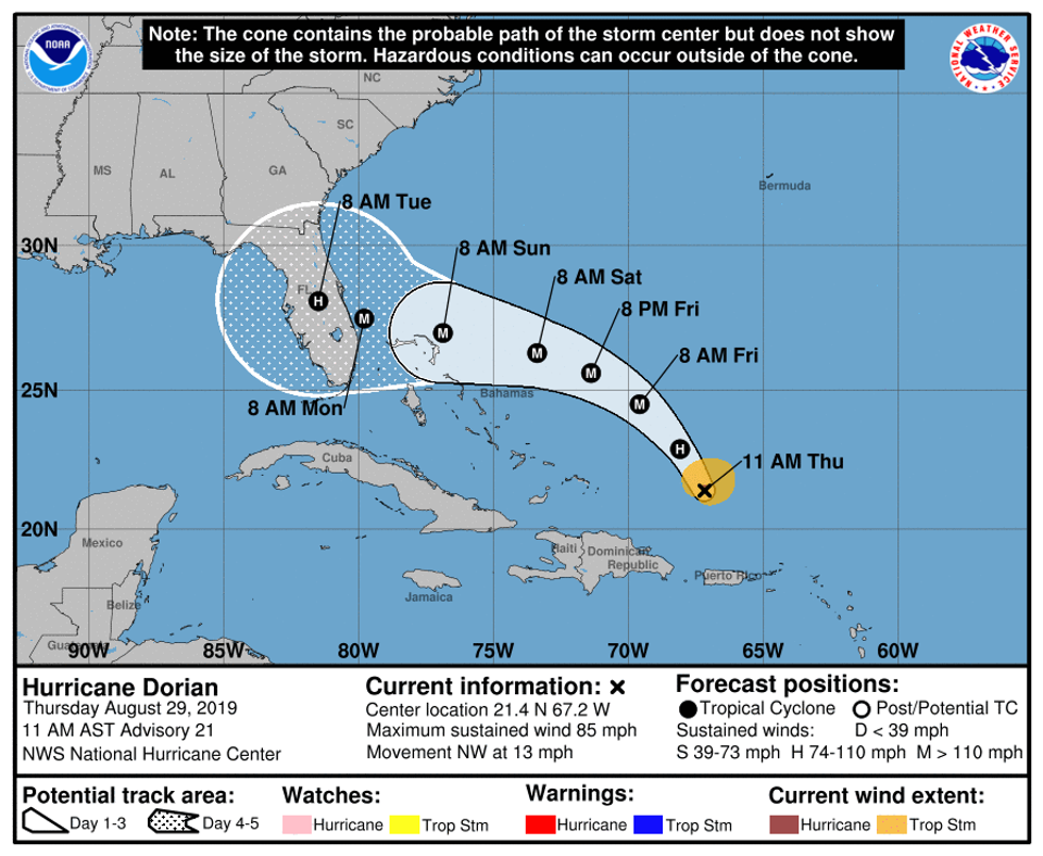
Don't focus on the center line
Don’t treat the center line of the IHME forecast charts as a precise prediction, any more than you would assume that a hurricane will follow the center line on the NHC hurricane forecast cone images. The forecast is a wide range, not a specific number.
Many people are misinterpreting the COVID-19 forecast model from the University of Washington’s Institute for Health Metrics and Evaluation. In Florida, we already have some experience with one of the ways that people are misinterpreting the forecasts from our experience interpreting hurricane forecasts.
It’s a range, not a precise prediction
On the morning of Friday, 13 August 2004 during Hurricane Charley, the National Hurricane Center’s forecast for the path of the hurricane showed a cone of uncertainty for where the storm would make landfall that showed the center line of the storm passing directly over Tampa Bay.
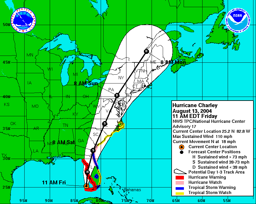
Then the forecast changed that afternoon, shifting the center line to Charlotte County, a hundred miles south of Tampa. That area, full of retirees, was devastated when the hurricane struck Punta Gorda in Charlotte County. People hadn’t evacuated because they thought that the NHC was telling them that the storm was going to hit Tampa Bay, a hundred miles north of them. Misinterpretation of a forecast graphic cost lives.
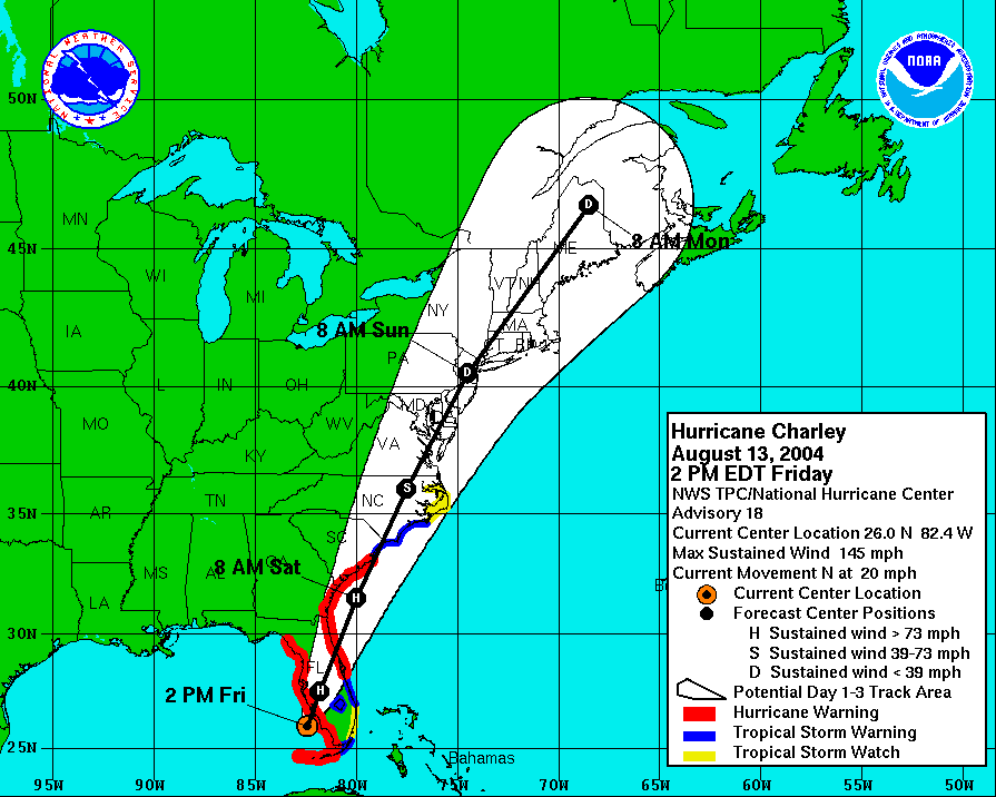
Meteorologists at the National Hurricane Center are so concerned that people will pay too much attention to the center line of the hurricane track forecast cone images[1] that they have removed the center line from the default forecast images. They do still publish a set of forecast images with center lines, but the default images no longer include the misleading center track.
Same problem with COVID-19 projections
The easy-to-understand center line in the IHME charts comes with the exact same problem. Many people, including even President Trump, have misinterpreted the center line of the IHME projections. Trump’s famously-optimistic projection that only 60,000 people would die in the entire COVID-19 epidemic in the US was an obvious misinterpretation of both the center line of the IHME charts and the overall intent of the model: to project the impact of the first wave of the epidemic.[2]
Unfortunately the center line on the charts leads people to treat the model like a crystal ball that will give them a specific answer. And then when the real death count doesn’t track the center line exactly, they’re disillusioned and they reject the whole model. Or when researchers update the parameters of the model and the forecast line changes. This stems from a tragic misunderstanding of what the model is trying to forecast and now it works.
In the worst case, people will misinterpret the IHME model’s reports as saying that the threat of COVID-19 is over and that it’s okay to stop the social distancing.
Not a crystal ball
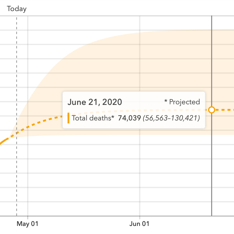
The readout on the dashboard of the IHME model forecasts the deaths precisely:
74,073 COVID-19 deaths projected by August 4, 2020
All the way down to seventy-three? Really?
No. The actual forecast, as of this writing, is a wide range. From about 57,000 deaths by August 4 to about 130,000 deaths, or anywhere in between.
Misleading journalism
It’s especially dangerous when journalists misunderstand the IHME results and report on them, because they inadvertently spread risky misinformation. In one recent example, CNN reported that “Last week, the model projected 67,641 deaths from Covid-19.”
This is an example of false precision, when numerical data is presented in a manner that implies better precision than is justified.[3] Stating the forecast in terms of a precise center line confuses readers. Such an exact projection is obviously ridiculous, and people who spread misinformation have used that to ridicule the overly-precise IHME forecasts and advance a narrative that the experts have been completely wrong about the virus.[4] When the real numbers don’t track the forecast precisely, people then misinterpret or misrepresent the error as evidence that the entire model is invalid.
We can’t blame CNN too much in this case, because the false precision comes directly from the IHME dashboard. The charts on the dashboard clearly show a forecast range, but they also give a handy total. Currently “74,073 COVID-19 deaths”. The number of significant figures in the dashboard’s own totals are inappropriately overstating the precision of the forecast,[5] and are misleading to the public.
Journalists should cite the full range of the forecast and the caveat that the model is only forecasting one wave. For example: “The IHME model currently forecasts the total death rate in the US from the first wave of the COVID-19 outbreak will fall in the range from about 22 thousand people to about 122 thousand people.” Journalists should not overstate the precision of the forecast by reporting the center line of the projections or by using too many significant figures. And the models themselves should avoid portraying false precision by stating broad ranges instead of the center-line forecast.
Another big misconception
Another popular misconception about the IHME forecasts is the idea that the model predicts a single wave, possibly in part because the model’s charts all show a single hump that peaks and then subsides. That isn’t what the model is forecasting, but you have to understand how the model works to understand that the charts showing the infection dropping to zero and then staying at zero are not really forecasting that the infection will do that. The model is only forecasting the impact of the first wave. The phrase "by August 4" is important!
Conclusions
The IHME’s COVID-19 forecasting model dashboard overstates the precision of the model’s projections. This does a disservice to planners and to the public by encouraging them to look at the model as a crystal ball with a precise answer, when it really is forecasting a wide range of possible outcomes. The report designers on the modeling teams and journalists could both serve the public better by stating the forecast results more carefully as a range rather than as a specific number.
Don't focus too much on the center line of the IHME forecast charts, any more than you would assume that a hurricane will follow the center line on the NHC hurricane forecast cone images.
References
- 1. Broad K, Leiserowitz A, Weinkle J, et al. Misinterpretations of the “Cone of Uncertainty” in Florida during the 2004 Hurricane Season. American Meterological Society; May-2007 link (Accessed 2020-04-27 16:00)
- 2. Bump P. Misunderstanding the math, Trump embraced a coronavirus death toll we’ll soon surpass. 24-April-2020 link (Accessed 2020-04-28 9:30)
- 3. False precision. Wikipedia; 17-April-2020 link (Accessed 2020-04-28 10:00)
- 4. Knight D. Virologists & Epidemiologists Question COVID Lockdowns. Infowars; 21-April-2020 link (Accessed 2020-04-27 21:30)
- 5. Significant figures. Wikipedia; 24-April-2020 link (Accessed 2020-04-28 10:00)
Tags
Related
Rebekah Jones managed the Florida COVID-19 dashboard until she tried to add a feature to show which counties comply with the reopening criteria. Now you can see what got her fired.


